The first-print edition of The Great Ace Attorney Chronicles for the Switch includes “From the Vaults”, which is basically a digital artbook containing concept arts with commentaries, along with other tidbits, about the game. A friend of mine just finished the game and didn’t have the bonus artbook so I figured I’d post some of it here for her, but also for any of y’all who are interested.
This contains major spoilers for The Great Ace Attorney 1 and 2, so don’t look if you haven’t completed both games! Also this is only some of the pages, biased to our favorites and those I find particularly insightful. I might add more later.
All the design notes are from the character designer and art director, Kazuya Nuri (who is an unprecedented genius in my opinion)! All typos are mine, however.
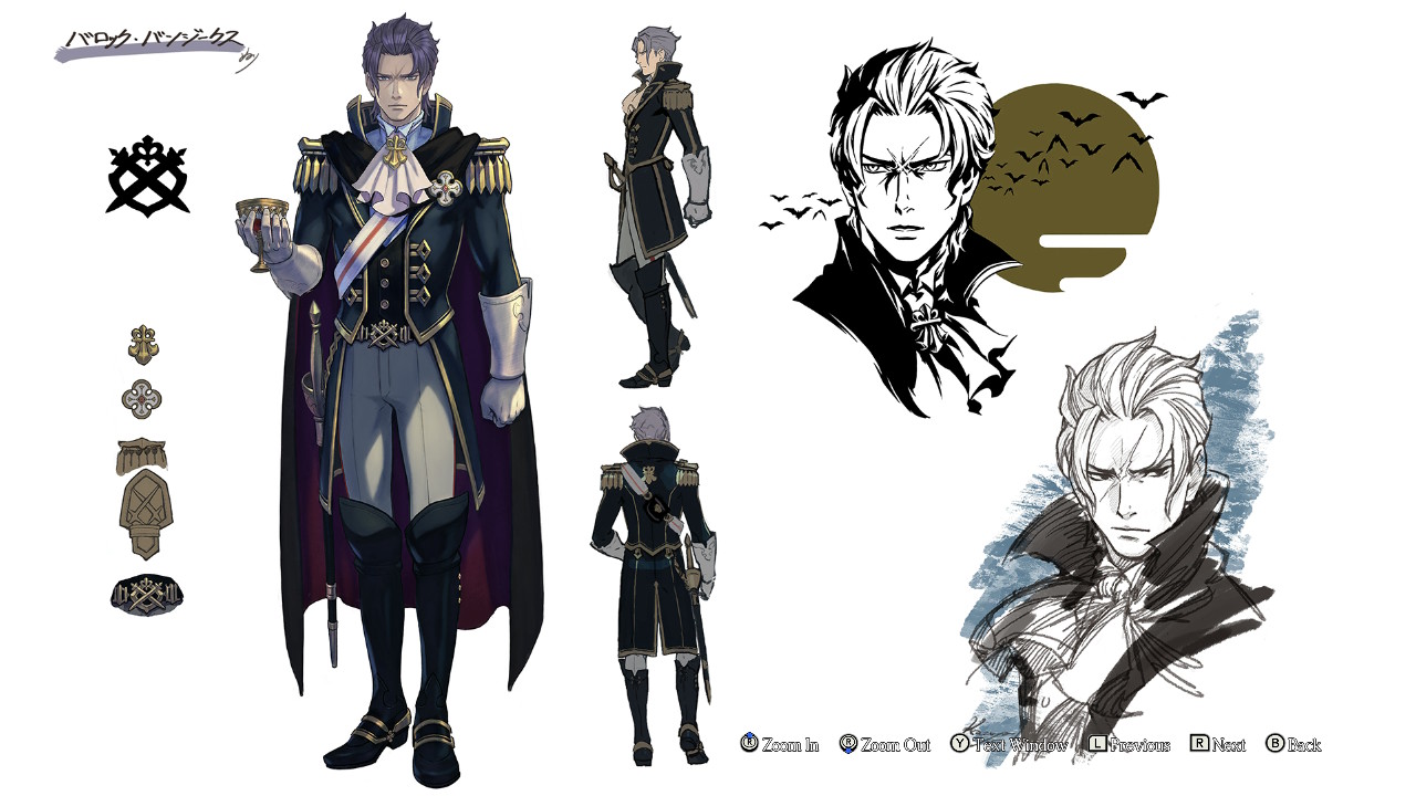
Barok van Zieks – I’d drawn two versions of van Zieks — one with and one without his cloak — so that they might be used during the early and final days of the first game’s promotion respectively to show him in two different lights.
Unfortunately, only the cloaked one where most of him was shrouded to show his Reaper of fthe Bailey façade was ever used, so I made sure that this Resolve illustration would show both his dark demigod and aristocratic prosecutor sides.
I had also hoped we could create new in-game character model based on his ope caped look in the second game, but sadly it was not to be.
There were a number of mysteries surrounding van Zieks related to his past and the ‘Reaper’ moniker at the end of the first game, so it was a great relief to finally resolve them all in the second.
Being able to draw him as he really is and show a different side of him from the Reaper was the greatest catharsis for me.
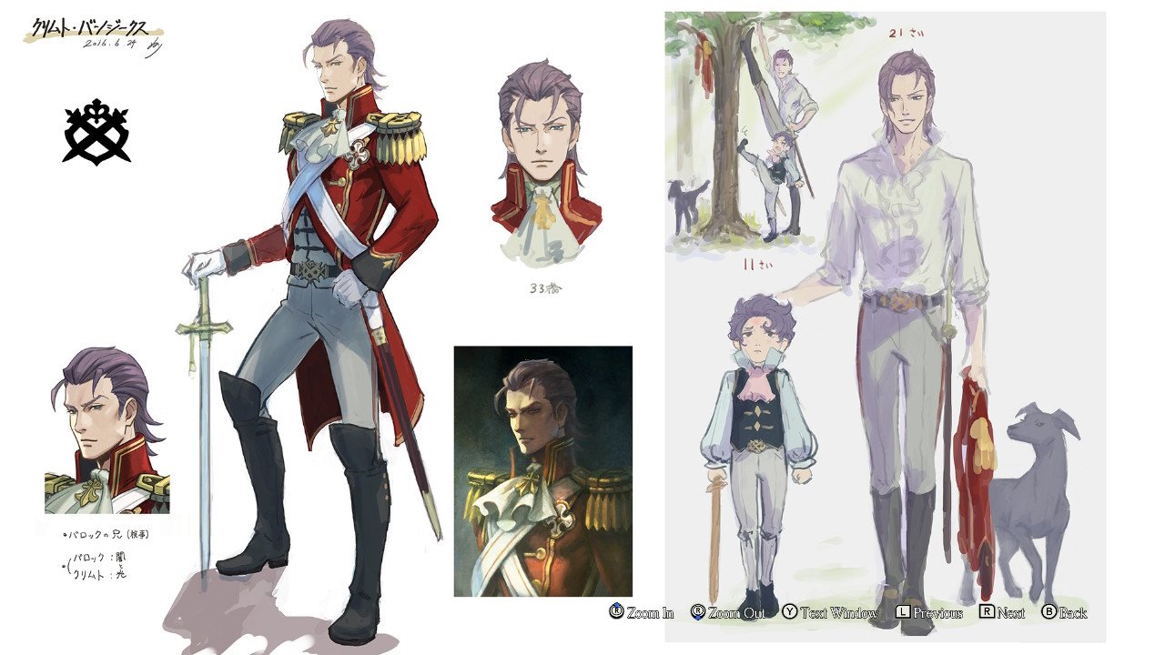
Klint van Zieks – Klint only appear in illustrations throughout the game, but as he is a key figure in the story, I approached his design as though he were a main character.
I set about creating his design by retaining certain elements to create similarities between the brothers whilst inserting new elements to contrast the differences between Barok’s yin and Klint’s yang.
As with Barok’s navy blue, Klint’s red jacket is a reference to the traditional colours of the uniforms of the Queen’s Guard, and was just the thing to convey his positivity and brilliance.
First introduced in Adventures, the crossed swords in the van Zieks family crest are actually also a representation of the two brothers, thought as the emblem was used over many generations, I can’t very well say it’s only all about them.
Using a pair of crossed swords as a belt buckle also hints at how they’ve become bound by honour and glory, which was holding them back in various ways.
The badge on Klint’s chest was also meant to serve as a memento of him for his little brother, which we were finally able to show in Resolve.
Narratively, I was able to make one very influential contribution in relation to Klint. One day, I very boldly proposed to the director, Mr Takumi, ‘How about making Klint’s hunting dog, the “Baskerville Hound”?’
At the time, Mr Takumi himself hasn’t quite hit upon how to solve the Baskerville problem yet, so he wasn’t even sure if he was going to include it in the story. Therefore, I figured I had nothing to lose by suggesting it.
Aristocrats often went hunting with their dogs back then, so it seemed like a period-appropriate way to show Klint’s social status and charismatic personality and connect him to the specifics of the case.
I also suggested placing a certain vital piece of evidence in a very specific location.

Genshin Asogi – My goal with his design was to convey Genshin’s standing as the head of the Asogi clan, a family of samurai warriors going back generations. And as Kazuma’s father, he also shares a number of traits with his son.
The first is the thin white strip of cloth he uses to tie his hair back, which flutters in the winds of change that blows around him. The second is the Western suit and boots he dons.
By virtue of willingness to travel to Great Britain, I felt that he too must have been a progressive thinker, so I made his clothing resemble those of Kazuma. And of course, he wears the great sword, ‘Karuma’ by his side as well.
In addition to these shared straits, I gave Genshin a slim yet athletic build to give the impression that he’s very fit and light on his feet.
Family Crest – ‘Swords and snake eyes’ was the theme that was established for the Asogi family crest during the development of the first game, but seeing as they descended from samurai and that this was something I could use to hint at the darkness lurking beneath the depths of Kazuma’s personality, I simply fell into this design as the most obviosu choice.
The fact that I could use it in a meaningful way in Resolve and that I could tie it into the Apprentice’s design is something I’ll raise a toast to my past self for.

Masked Apprentice – I’d suggested the idea of giving van Zieks a young male judicial assistant during the development of the first game, and whilst it was well-received, he couldn’t be included due to time restraints.
I made the suggestion anew during the second game’s development, and I was told. ‘It’ll be hard to add a new character now, but let me see what I can do.’ I certainly didn’t expect things to turn out the way they did.
Originally, I’d proposed that this younger judicial assistant could act as a rival to Susato, and that he and van Zieks would enjoy a close and heated dynamic. Instead, their cooler, more distant relationship worked out rather well, I think.
Visually, he was to serve as a backdrop to his mentor. Coupled with the need to create the biggest impact possible when his true identity is finally revealed, very little besides his mask is visible in order to create an aura of mystery.
Prosecutor Kazuma Asogi – From a narrative perspective, Kazuma represents the theme of confluence and contrast between East and West. As such, this prosecutor’s outfit is based on Western clothing with Eastern flourishes.
Another major task for me was how to change his appearance whilst keeping to the core elements of his design and overall form. For example, the swapping of Kazuma’s university uniform for a military-style dress uniform.
Other examples include the replacement of hsi Eastern hachimaki headband for a Western ascot tie and his Japanese katana for a European sabre, and his eventual use of both swords at the same time.
His main colours take inspiration from the Japanese flag and white snakes, which hold spiritual significance in Japanese folklore. His family crest, which is based on real janome snake eye crests, and mask are both snake-themed too.
He’s also predominantly white to stand in contrast with Ryunosuke’s black uniform. I was completely sure this was the way to go when I envisioned how his dramatic return would play out when he regained his memories — a bright form emerging from under a dark cloak like a beam of light chasing the haze and darkness away (and also as though he were shedding the dark varsity jacket of his past like a layer of old skin).
Like van Zieks, the details in Kazuma’s design serve to convey the affluence of he prosecution whilst in contrast, the relative simplicity and modernity of his outfit conveys a sense of progress.

Yujin Mikotoba – MIkotoba’s surprising past is finally revealed in Resolve. Of course, all of his backstory had been set during the first game’s development, so everything I’m about to finally share I drew during my time on Adventures.
Mikotoba’s Western suit that appears in Resolve was actually designed in conjunction with his Japanese kimono. In fact, the colour of his suit is more or less what decided the colour of his hakama trousers for me.
Therefore, the real focus of his design was not on his relation to Susato as her father, but rather on his relation to Sholmes as the great detective’s legendary partner, ‘Dr Wilson’.
On the surface, he’s a serious-looking man with a soft amiable charm. Young Mikotoba was designed to pair well with Sholmes and to seem more full of vim and vigour than his older self, wrapped in an aura of style and gentle kindness.
Young Mikotoba is one of my favourite design, and whilst I couldn’t show him off in the game itself, I’m glad I am able to share him with you here.
The Legendary Pair – Here we have Sholmes and his partner in their youth. In my mind, Young Sholmes was much rougher around the edges than he is now. Though I suppose everyone goes through that at some point in their life, right?
And I like to think that it’s thanks to living with Iris that his rought edges have been sanded down quite a bit now … because it’s the people and life experiences we hold dearest that change us the most.
The Mikotoba Step – The splashiest secret of Resolve dubbed the ‘Mikotoba Step’ by the development team!
I proposed this as a way to give Mikotoba a unique yet complimentary animation to Sholmes’s grand flourishes and gestures during their Dance of Deduction without completely deviating from his usual gentlemanly ways.
After all, a true partner is one with the confidence to bring their own unique talents to the fight.
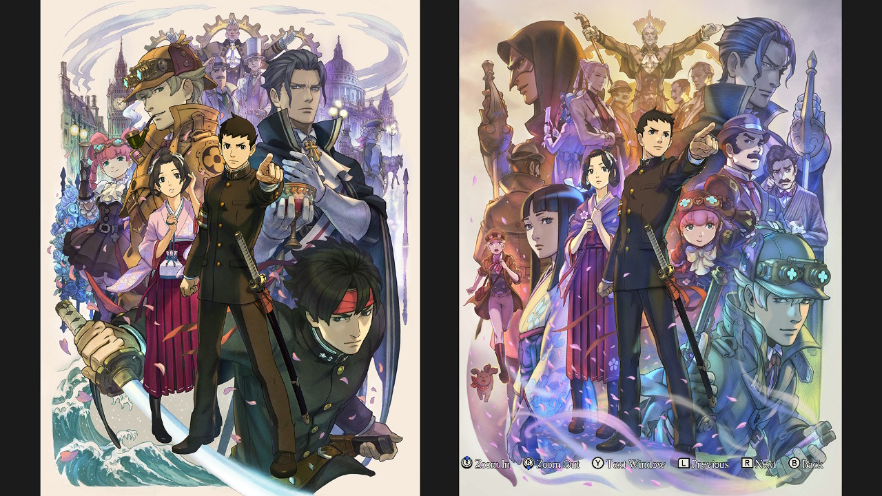
‘The Great Ace Attorney: Adventures Key Visual – I worked to capture the themes, atmosphere, and a general sense of the world itself in one illustration that embodies the whole of the first game with this piece.
It’s split roughly into two sections with images of Britain dominating the upper half whilst Japan takes the lead in the lower. From the fully drawn blade a great wave arises, lifting sakura petals up into the English roses above.
In this way, I’ve created a natural line for the eyes to follow that also conveys the trajectory of the story as it starts in Japan and shifts to Great Britain.
Ryunosuke’s face hints at his iron will hidden deep within, whilst Susato’s shows a slight unease. Their expression suggest how the story of their ‘Adventures overseas ultimately comes to a close.
‘The Great Ace Attorney 2: Resolve’ Key Visual — Adventures was the first title in the Ace Attorney series to diverge so greatly from the mainline games in its setting that the key visyual for it focused heavily on conveying the period, locales, and the general atmosphere of the world itself. However, with Resolve, it was time to move away from the setting, so the composition of this visual works to emphasize the dramatic tale that binds these characters to one another.
Ryunosuke stands at the centre with a look of strong resolve in his eyes whils Susato stands next to him with a wrap draped around her shoulders. It’s as though even after they were forced apart, fate has brought them back together.
The top centre represents a different time and shimmers with the golden light of a bygone era. From there, the light quickly faces into the dark shades of twilight and the mood shifts along with the colours to reflect the relationships between and destinies of each character present.
Cherry blossoms, which are often used as a symbol of Japan, swirl around them like an embrace or a strong gust of wind. The ephemeral nature of sakura is layered atop a metaphor that the petals that had falled to the ground in Adventures wil be swept up into the air again in Resolve by this gust of wind (or perhaps ‘headwind’ in Ryunosuke’s case).
All in all, I’ve painted a lot of meaning into this illustration, from each character’s placement to the overall composition and colours, for you to discover once you’ve finished the game. So who knows? Perhaps you might even find something new.
I also meant for this to be a companion piece to the key visual for Adventures, so it’d make my day if you were to let your imagination run wild as you view the two pieces side by side.
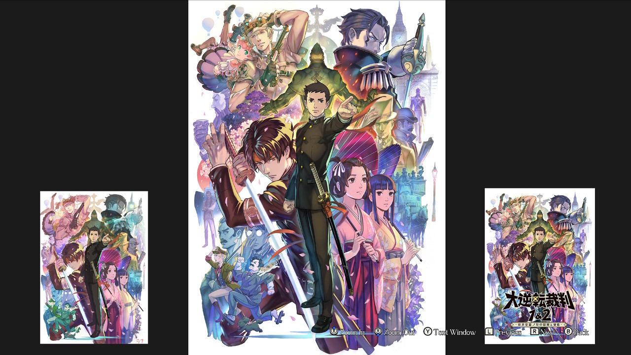
‘The Great Ace Attorney Chronicles Key Visual — I aimed to distill the essences of both Adventures and Resolve and blend them into a single piece that shows both the world and the story of The Great Ace Attorney with this.
Additionally, now that both the halves of the tale has been told, and with the passage of time, I was also able to draw characters as I truly see them in this moment.
As with my other key visuals, I put all my heart into capturing a lot of different things in this one’s ‘composite picture’ — a single illustration that evokes the game’s world and the story whilst bringing out the charm of each character.
Because were I to draw each element separately, I should think I’d need something akin to a long picture scroll just to link them all together. And really, at the end of the day, I simply wanted to draw a beautiful picture.
I sincerely hope that these key visuals can serve as your motivation to keep on playing and maybe even as the key to unlocking some fond memories of the game once you’re through.
Nothing would please me more than if my art could inspire you to lose yourself in the idyllic world of The Great Ace Attorney.
